Dark theme in a day
Using a bunch of modern CSS to create a night mode for an app
I recently spent some time with a startup called Kite to work on the typography of their tools. Among their group of smart utilities helping programmers code, the centerpiece is a native/web app named Kite Copilot that sits by your editor to lend a helping hand. It looks like this:

One early afternoon, a programmer using Copilot wrote to us suggesting adding a second, dark colour theme: a way to convince the app to use light text on a darker background. It made sense. The dark theme is something preferred by many programmers — indeed, a default in many modern editors like Atom or Visual Studio Code. Right next to an editor with a dark theme, Copilot can feel like it dressed up for a wrong kind of party:

I started wondering if it was possible to add a dark theme that very afternoon, promising myself that I would move on to other things the next day rain or shine, whether I finish or not.
This is a story of how a few new-ish CSS options came together like a bunch of superheroes in a summer blockbuster movie, and allowed for this project to indeed take up one afternoon, and not much more.
CSS variables
I knew immediately that this project could not happen without CSS variables, and I was excited to try them for the first time in native CSS (I’ve only known them before courtesy of LESS). I started by turning all the existing hardcoded colors into variables, and then reducing the number of variables to the absolute minimum. It looked something like this:
Before.main {
  background-color: #eef4f7;
  color: #0a244d;
}
.docs {
  color: #0c2959;
}Afterhtml {
  --background: #eef4f7;
  --text-color-normal: #0a244d;
}.main {
  background: var(--background);
  color: var(--text-color-normal);
}
.docs {
  color: var(--text-color-normal);
}
I didn’t, however, wait to systematize everything in the light theme, and only then come up with a nightly alternative. As a matter of fact, I did the exact opposite. I created the simplest scaffolding of the second theme… and immediately enabled it. The reason for this was simple: this approach made it easier to see which colours among the dozens of CSS files (most I have never traversed before) I missed and didn’t turn into variables yet. Anything that was off was easy to spot in the increasingly darker and darker universe:

I also cleaned up a few other adjacent areas. I removed any opacity that was paired with colours, and baked the lightness into the colours themselves. I removed any alpha values (rgba), too. That made it easier for me to trust them again, since some of the half-transparent colours could become backgrounds atop other elements with other background colours, and it was impossible to predict their interaction.
Before.home {
  color: #0a244d;
}
.home__version {
  opacity: 0.7;
} Afterhtml {
  --text-color-normal: #0a244d;
  --text-color-light: #8cabd9;
}
.home {
  color: var(--text-color);
}
.home__version {
  color: var(--text-color-light);
}
The only opacity I kept was for disabled UI elements — its presence was well-defined, and made things simpler.
Lastly, I also created a variable for shadows used on popovers, as I needed the shadows to be more prominent in the dark theme.
Expressing colours
Then, I took variables one tiny step further. I didn’t want to assume that the colours would always come from the Design world and the job of Engineering would only be to plug them in. There was a practical reason, too: playing with colours live by editing the file seemed like the best way to optimize the palette.
And so, in order to make everyone’s life easier (starting with my own), I moved to describing all the colours as HSL:
Beforehtml {
  --text-color-normal: #0a244d;
  --text-color-light: #8cabd9;
}Afterhtml[data-theme='dark'] {
  --text-color-normal: hsl(210, 10%, 62%);
  --text-color-light: hsl(210, 15%, 35%);
  --text-color-richer: hsl(210, 50%, 72%);
  --text-color-highlight: hsl(25, 70%, 45%);
}
I find HSL the most satisfying way to navigate the world of colours, the three components having clearer responsibilities than the opaque and arbitrary dials of RGB (where brightness is a complicated formula rather than just a number, and saturation is buried very deeply).
But there was another benefit: I could add secondary variables for main hues of the colour theme.
html[data-theme='dark'] {
  --hue: 210; /* Blue */
  --accent-hue: 25; /* Orange */  --text-color-normal: hsl(var(--hue), 10%, 62%);
  --text-color-highlight: hsl(var(--accent-hue), 70%, 45%);
}
I wanted to make it easy for the person coming after me to understand the relationships between colours. Even without the hue variables, HSL would make it easier; all the colours starting with hsl(210 would be immediately recognizable as a family. But making 210 another tightened the screws a little bit. It was my way of saying “feel free to experiment with colours, but the act of adding another hue should be an intentional one.”
Plus, changing the hue value was another way to test the integrity of the theme. Any colour not changing would mean a colour accidentally left behind:

I considered going even further, expressing some colours as variations on others. But that felt like overkill here. The slightly inelegant way CSS expresses variables, combined with the need for calc() would make this CSS much less readable.
And so, this is what I ended up with:
html[data-theme='dark'] {
  --hue: 210; /* Blue */
  --accent-hue: 25; /* Orange */  --text-color-normal: hsl(var(--hue), 10%, 62%);
  --text-color-light: hsl(var(--hue), 15%, 35%);
  --text-color-richer: hsl(var(--hue), 50%, 72%);
  --text-color-highlight: hsl(var(--accent-hue), 70%, 45%);  --link-color: hsl(var(--hue), 90%, 70%);
  --accent-color: hsl(var(--accent-hue), 100%, 70%);
  --error-color: rgb(240, 50, 50);  --button-background: hsl(var(--hue), 63%, 43%);
  --button-text-color: black;  --background: hsl(var(--hue), 20%, 12%);
}
Switching between themes
The theme was applied to a data attribute on top of <html>. A class would be okay, too, but in my head classes feel like checkboxes, whereas data attributes act more like radio buttons. It felt like a moot distinction at this very point — we only had two themes — but I wanted to think a bit ahead.
Definition in CSShtml {
  --hue: 210; /* Blue */
  --text-color-normal: hsl(var(--hue), 77%, 17%);
  ...
}html[data-theme='dark'] {
  --text-color-normal: hsl(var(--hue), 10%, 62%);
  ...
}Invocation in JavaScriptdocument.documentElement.setAttribute('data-theme', 'dark')
document.documentElement.setAttribute('data-theme', 'light')
(Note that the default theme was expressed without any qualifiers. This ensured that if something went wrong and the data attribute disappeared, things would still remain readable.)
This was perfectly functional, but switching the theme back and forth felt abrupt. This was effectively a light switch, but there was a reason I installed fade-in and fade-out light switches in all the rooms I spend significant amount of time in. And so, I installed one in Copilot’s CSS, too:
html.color-theme-in-transition,
html.color-theme-in-transition *,
html.color-theme-in-transition *:before,
html.color-theme-in-transition *:after {
  transition: all 750ms !important;
  transition-delay: 0 !important;
}
This class, color-theme-in-transition, effectively tells the browser “for literally any style that changes from now on, make it a transition.”
Applied all the time, and every incidental hover color change or transition would become a slo-mo nightmare, belonging more in a Zack Snyder movie than in a productivity tool for programmers. But if we were to add this class tactically a moment before changing the theme, and remove as soon as the transition was over, it would give us in a beautiful crossfade:

document.documentElement.classList.add('color-theme-in-transition')
document.documentElement.setAttribute('data-theme', theme)
window.setTimeout(function() {
  document.documentElement.classList.remove('color-theme-in-transition')
}, 1000)
This was possibly my favourite bit of the project, seeing different departments of CSS working together as a team. The change to the attribute made the new set of variables take over the old ones, automatically. After that, all of the new colours inside those variables would then slot themselves in all the places where they were used… but not before another department of CSS would hold them gently in place, stretching what would otherwise be a blink of an eye into a better part of second. Just one new class and one attribute change, and the complex machinery of CSS would come to life in one magically coördinated moment.
CSS often feels clunky and awkward. I can’t say I’m a fan of the way you express variables in it — it looks weird and I keep putting the double dashes in the exact wrong place. But when CSS goes, it goes. And in that very moment, it was fun to watch it go.
(Caveat: this worked really well in Firefox, but Chrome sometimes still struggled, transitioning some parts too late or not at all.)
Theming vector icons
The colour variables took great care of text. But then the dreaded moment came when it came to taking care of the visual elements. A bunch of iconography in Kite’s Copilot existed as vector SVGs as backgrounds:
.sidebar__icon__settings {
  width: 2rem;
  height: 2rem;
  background-image: url(./icon-settings.svg);
}
As far as I know, you can only colorize SVGs with CSS in some circumstances — when you embed them inline, or when you use them as images. But you couldn’t do it in this scenario. And without it, icons in the dark theme would look bad if not downright disappear:
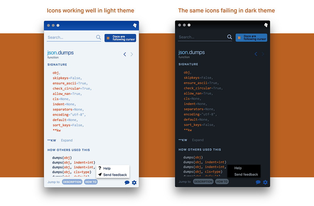
Fortunately, there was another way than creating two versions of all the SVG files. I could use a mask instead of a background:
mask-image: url(./icon-refresh-white.svg);
mask-repeat: no-repeat;
mask-position: center;
background: blue;
What the above bit means is “turn the entire thing blue, but then cut away everything that’s not covered by the shape of the SVG.” If the SVG has a transparent background, it works beautifully. And in that case, it did:

And, to make the transition even easier, the syntax for mask and background is basically interchangeable — with things like background-repeat, background-position, and background-size having perfect doppelgängers on the mask side.
Beforebackground-size: contain;
background-repeat: no-repeat;
background-position: center;
background-size: 1rem;
background-image: url(./icon-back.svg);Aftermask-size: contain;
mask-repeat: no-repeat;
mask-position: center;
mask-size: 1rem;
mask-image: url(./icon-back.svg);
background-color: var(--link-color);
There are caveats, of course. You can only use a single colour this way. Plus masks, while supported relatively well, still require to be prefixed for webkit.
Most importantly, applying a mask prevents you from doing anything else in the same element: any border, any outline, any text becomes masked away too. In a few instances I had to creatively demote the icon to a :before or :after pseudo-element, which fortunately can be masked independently of the main one.
Without this method, the project would probably stop in its tracks. The thing is I feared it was about to anyway, since there was one type of visuals standing in my way.
Theming images
Kite also has regular bitmapped images interspersed through some of the developer documentation. They looked something like this:

Seeing a big rectangle of white scroll into view wasn’t just aesthetically displeasing. I imagined that while for some people a dark theme is just a visual choice, some — even many — might enable it to take a better care of their eyes. I didn’t want the theme to go 95% there, but then behave like an annoying moviegoer pulling out their smartphone on maximum brightness, and texting in the middle of the aforementioned Zack Snyder movie.
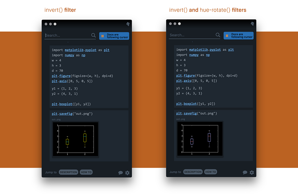
Fortunately, modern CSS saved me from redoing all the images by hand, or writing a script to process and re-save them. I could use a CSS filter to easily invert every image:
html[data-theme='dark'] img {
  filter: invert(100%);
}
The image didn’t look quite right, though, with completely different colours. But I remembered a trick I picked up in Photoshop years ago: Invert the image image and then rotate its hue halfway through, and the image will look much more natural. It doesn’t work so well for photos, but for any charts and diagrams it is basically flawless. Luckily, those were the kind of photos you’d encounter in Kite app.
And, luckily once again, there was also a CSS filter that allowed me to do the exact same thing automatically:
html[data-theme='dark'] img {
  filter: invert(100%) hue-rotate(180deg);
}
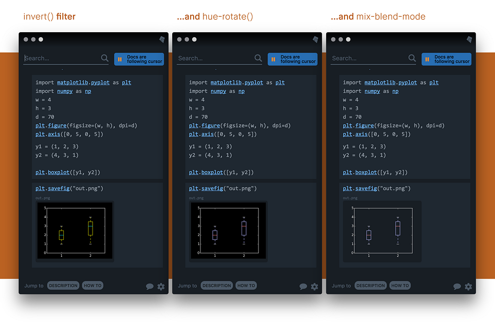
And then, I could go even further! Another once-photoshoppian thing is now available in CSS; using a blending mode I could make the visuals feel even more at home — by making its darkest pixels effectively become transparent:
html[data-theme='dark'] img {
  filter: invert(100%) hue-rotate(180deg);
  mix-blend-mode: screen;
}
I could even bring back the blending mode to the original theme, and make that one better as well (multiply is the opposite of screen, so it’d work as well for outputting on light background). Once again, the addition of a dark theme ricocheted into improving the original one, too.
img {
  mix-blend-mode: multiply;
}html[data-theme='dark'] img {
  filter: invert(100%) hue-rotate(180deg);
  mix-blend-mode: screen;
}

And that was it. Those few lines of CSS made the project complete. (Depending on your needs, you could consider simply reducing the brightness or contrast rather than inverting — both also available via CSS filters.)
Theming the scrollbar
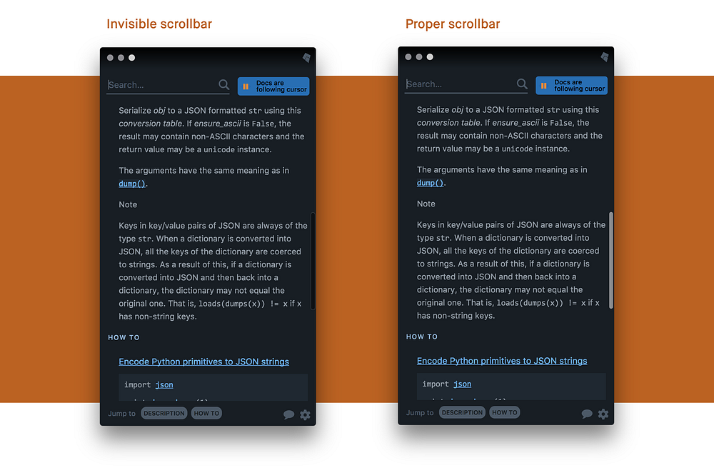
Well, almost complete. If images and icons kept their bright liveries and had to darkened, we faced the opposite issue with Mac’s autohiding scrollbar — it was black (and basically invisible) even in the dark mode.
I first started by experimenting with the vintage Webkit scrollbar CSS values and got somewhere half-decent, but we soon learned it came with a terrible price: any change to those made the scrollbars visible all the time, even if your Mac option was set to have them hidden until you scroll.
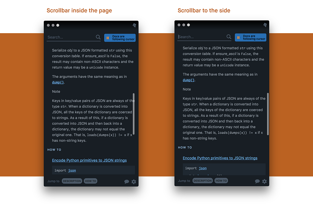
I went back to the drawing board. It turned out I didn’t need to worry about styling the scrollbar, but convincing the scrollbar to style itself. Mac’s scrollbar can actually turn light when needed. Except we weren’t scrolling the whole page, just a smaller element inside it, and for some reason that confused the scrollbar’s inner chameleon. Applying the background again directly to that scrollable element, even though redundant, made the scrollbar understand that it should become lighter:
.docs-page__content {
  background: var(--background);
  overflow-y: auto;
}
I also made sure that the scrollbar was glued to the edge. It’s annoying when the autohiding scrollbar sits in the middle and overlaps the content, and even more so in the dark theme. (And it makes it harder to grab if it’s by the edge of the screen!)
The solution was as simple as taking the padding from the parent element that wrapping the scrolling content, and moving it inside the scrolling element instead:
A high contrast theme
I also wanted to extend this project in another direction. I added one more theme — a high contrast one:

I will be the first to admit that this is not the best high contrast theme. Not only that: I am not even entirely sure what a good high contrast theme means. But I feel that it was important to at least start, to send the message that colours are not only about aesthetics, fashion, or comfort — to people with visual impairments, they might be the difference between being able to use the app or not.
The variables for the high contrast theme are beautiful in their simplicity…
html[data-theme='high-contrast'] {
  --text-color-normal: white;
  --text-color-light: white;
  --text-color-richer: white;
  --text-color-highlight: white;  --link-color: white;
  --bright-color: white;
  --error-color: white;  --button-background: white;
  --button-text-color: black;  --background: black;
  --popup-background: black;
}
…and the new theme also became another unexpected test for the integrity of my set of variables and how I applied them. If a high contrast theme ended up putting white text on white background — or black on black — it meant something went profoundly wrong in my thinking, and that the contrast on any of the other two themes was probably in trouble, too.
In this way, I once more experienced that tried-and-true effect: accessibility gives universally. Trying to increase accessibility doesn’t just benefit a certain group of people; it benefits everybody.
(I do believe that a proper high contrast theme needs to have more borders and other elements for the eye to hang onto. Please let me know if you know. The one thing I changed was the shadow becoming more of a border, as demonstrated below.)
html {
  --popup-shadow: 0 5px 16px rgba(0, 0, 0, .25);
}
html[data-theme='dark'] {
  --popup-shadow: 0 5px 32px black;
}
html[data-theme='high-contrast'] {
  --popup-shadow: 0 0 5px white, 0 0 5px white;
}
That was it. I was done with the dark theme late afternoon, and I spent a few more hours over the next few days adding a couple of finishing touches and bug fixes.
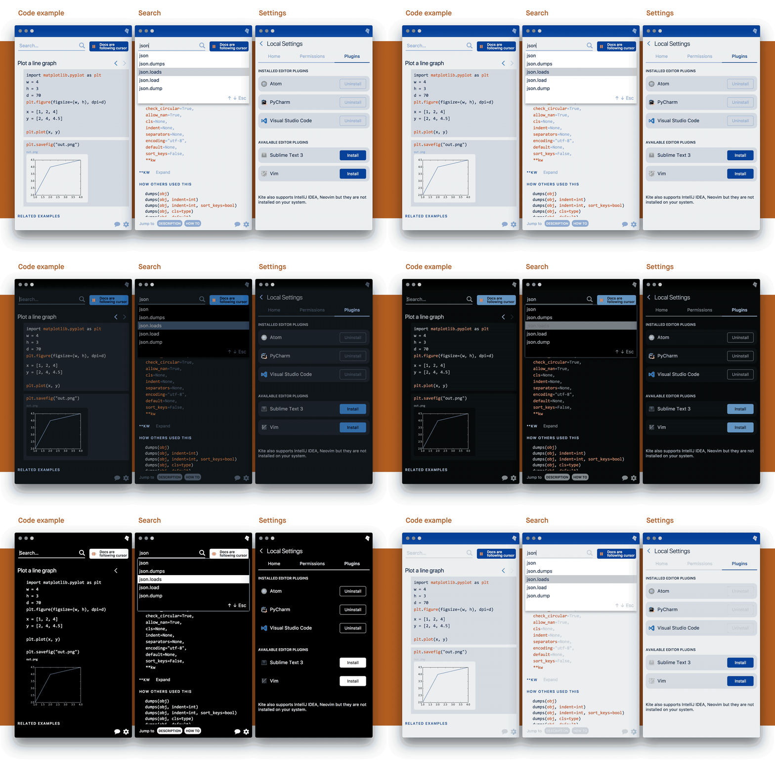
I was kind of amazed that all of this could happen via CSS and CSS alone: the colours, the transitions, the vectors, and even the images:
I’m curious if you have any other tricks to share? Any other new CSS properties that could come in handy? Or a different understanding of dark themes? Please respond to this post or let me know via Twitter.
Thank you to Dane Bratz at Kite for overseeing the implementation, and to Kathy Ahn for being my writing buddy for this article.
BTW Kite is hiring! I had a great time there. If you’re a designer excited about engineering — or an engineer with strong interest in design, reach out to them.
