Death to typewriters
Part II.
Making type read well and look good

We like the story of Bell Centennial, a typeface designed deliberately to be printed on a crappy phonebook paper. The shapes of Bell Centennial letters look weird when seen out of context… before you know that, during printing, the ink will spread out and make the letter forms look as intended.
This is the level of detail we want to see on Medium. Here are some things we’re doing:
❦
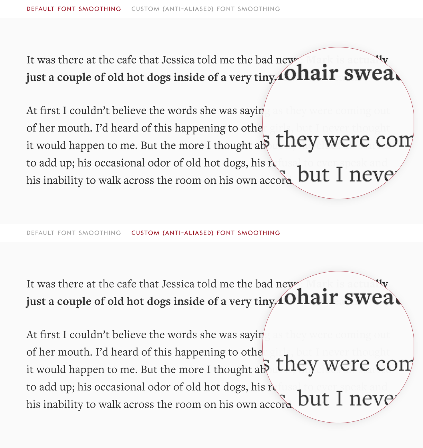
Font smoothing. We specify custom smoothing to make sure the font we use looks exactly right on the screen: not too wispy, not too thick.

❦
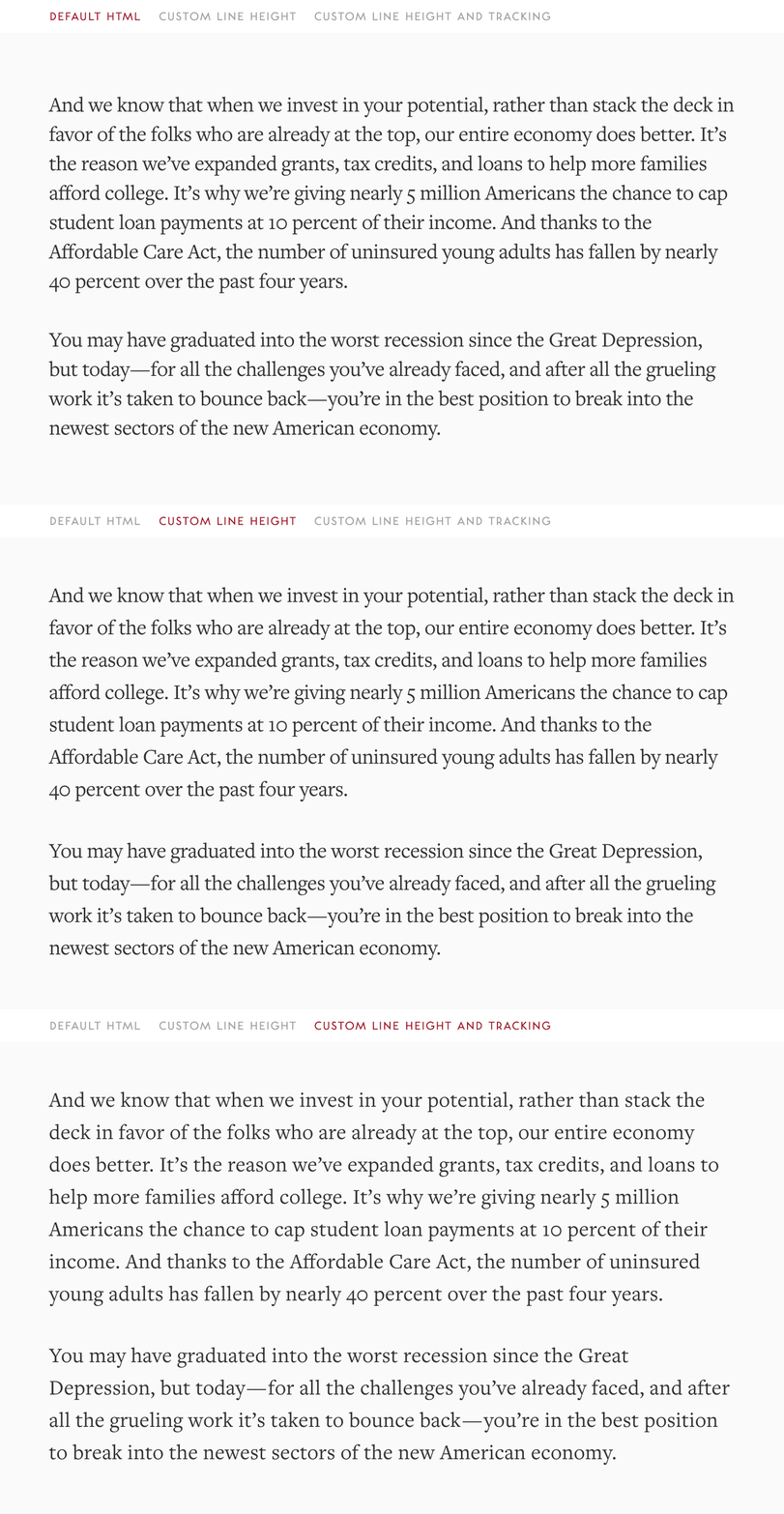
Line height and tracking. We adjust line height and tracking (letter spacing) of the fonts on our platform so it looks more legible and beautiful.

❦
Kerning. We switch our text rendering CSS option to optimizeLegibility, allowing — among other things — for proper kerning.

❦
Ligatures. The above, plus the fact we make sure that the ligature glyphs are present in the fonts we’re serving, allow us to automatically support common ligatures (fi, fl, ff, ffi, ffl).

There is nothing more amazing than seeing ligatures assemble under your text pointer as you’re writing.

❦
Cherry-picking glyphs. As we construct font files, we make sure that the characters we want are in there (namely ligatures and various spaces), but we also remove some for faster delivery of fonts (for example, rarely used math characters go away).
❦
Using different fonts for specific glyphs. We also cherry-pick characters from other fonts if we don’t like them in default ones, for example redacted characters ██████ go directly to Cambria and the pilcrow (¶) falls back to Arial.

❦
Code text alignment. For code blocks, we picked the font (Menlo) where normal and bold and italic text have the same measure. This ensures that code columns will align regardless of styling.


